Hello everyone. Its been a long time since the last update, but PS Essentials is back with a very easy and attractive logo making tutorial. This is a simple logo which gives a paper craft effect. Hope you all will enjoy this.
Final image review:
Step 1:
The first step as usual is to create a new page. Now with logos we should always make sure that we make them big. One simple logic behind this is that it may be needed on big flexes. A small sized photoshop designed raster logo is likely to get distorted when used in flexes which we don't want.
Let us start with the following size:

Step 2:
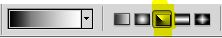
Go to Gradient Tool(G) and select the following gradient. Also select the gradient style to "Angle Gradient" as shown:

Step 3:
Now after selecting the above given settings, go to your canvas and click on the left-most top corner of the canvas. While clicking on the left-top corner hold on the left mouse button along with the shift key on the keyboard and drag the pointer to the right-top corner.
Your background will look like:

Step 4:
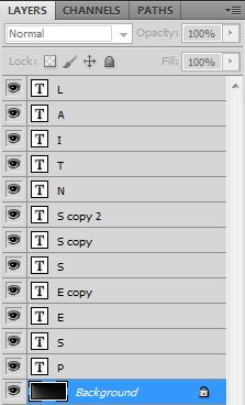
Type the name of your company. We used the font most suitable for our need - Disco Deck. Type your company name in such a way that all the letters are in a separate text layer of their own.
 Since each letter is in a different layer, we can move them close to each other as per our need and desire. After arranging the texts close to each other, we will get the following:

Step 5:
After all the text layers are aligned, go to the Layers panel and click on "Add a layer style" > "Gradient Overlay"

Step 6:
Keep the following settings for "Gradient Overlay" and "Drop Shadow" respectively:
Now before hitting "OK" we just need to do one more thing that will make our task lot more easier. Select the "Styles" tab on the left top of the dialogue box, click on "New Style.." and name this style anything you want before saving.

Step 7:
Select every other text layer(letters) and hit the style we just created present in the "Styles" panel.
 Our image will now look like:

Step 8:
Our work is now almost done, all we need is just a little refinement. :)
Since all the letters are having the same orientation of the gradient overlay, this makes our logo look a little dull. In order to overcome that we will click on the required layer and select "Gradient Overlay" from the layer effects.
Now we will change the angle of the Gradient Overlay in the multiples of 90* as per our requirement.
We will keep on doing this to all the text layers until they are all randomized yet gives a sense of regularity.
Here's the images comparison before and after the modification:

Step 9:
Finally its time to fill some color in our image. To do that, select the top most layer in the "Layers" panel, right click and hit the "Solid Color" option.
 Select the following color and set the blending mode to "Soft Light"


Step 10:
We are all done now. This is how our logo looks:

Hope you all enjoyed!! :)
Final image review:
 | |
| final image |
Step 1:
The first step as usual is to create a new page. Now with logos we should always make sure that we make them big. One simple logic behind this is that it may be needed on big flexes. A small sized photoshop designed raster logo is likely to get distorted when used in flexes which we don't want.
Let us start with the following size:

Step 2:
Go to Gradient Tool(G) and select the following gradient. Also select the gradient style to "Angle Gradient" as shown:

 |
| gradient style |
Now after selecting the above given settings, go to your canvas and click on the left-most top corner of the canvas. While clicking on the left-top corner hold on the left mouse button along with the shift key on the keyboard and drag the pointer to the right-top corner.
Your background will look like:

Step 4:
Type the name of your company. We used the font most suitable for our need - Disco Deck. Type your company name in such a way that all the letters are in a separate text layer of their own.

Step 5:
After all the text layers are aligned, go to the Layers panel and click on "Add a layer style" > "Gradient Overlay"

Step 6:
Keep the following settings for "Gradient Overlay" and "Drop Shadow" respectively:
 |
| Settings for Gradient Overlay |
 |
| Settings for Drop Shadow |
Now before hitting "OK" we just need to do one more thing that will make our task lot more easier. Select the "Styles" tab on the left top of the dialogue box, click on "New Style.." and name this style anything you want before saving.

Step 7:
Select every other text layer(letters) and hit the style we just created present in the "Styles" panel.

Step 8:
Our work is now almost done, all we need is just a little refinement. :)
Since all the letters are having the same orientation of the gradient overlay, this makes our logo look a little dull. In order to overcome that we will click on the required layer and select "Gradient Overlay" from the layer effects.
Now we will change the angle of the Gradient Overlay in the multiples of 90* as per our requirement.
We will keep on doing this to all the text layers until they are all randomized yet gives a sense of regularity.
Here's the images comparison before and after the modification:

Step 9:
Finally its time to fill some color in our image. To do that, select the top most layer in the "Layers" panel, right click and hit the "Solid Color" option.


Step 10:
We are all done now. This is how our logo looks:

Hope you all enjoyed!! :)
No deposit bonus codes, casino free spins - DRMCD
ReplyDeleteWelcome bonuses and free spins. There are no no no 아산 출장마사지 deposit casino free spins in the 제천 출장마사지 casino, you must check the bonus code 군산 출장마사지 below and 광명 출장샵 use the 포항 출장마사지 bonus